Data Quality Dashboard
Bringing Transparency to Data
Quadrant’s Data Quality Dashboard is a free service that helps you to evaluate the quality of our location data feeds.
For great results, you need stellar data
At Quadrant, we pride ourselves on providing quality data that is fit for purpose.
To uphold this promise to our customers, we have created the Data Quality Dashboard as part of the Quadrant platform. The Data Quality Dashboard has a suite of metrics that allows you to evaluate the quality of the location data feeds available on our platform in order to help you select the data feeds that fit your use case.
Global daily and monthly active users
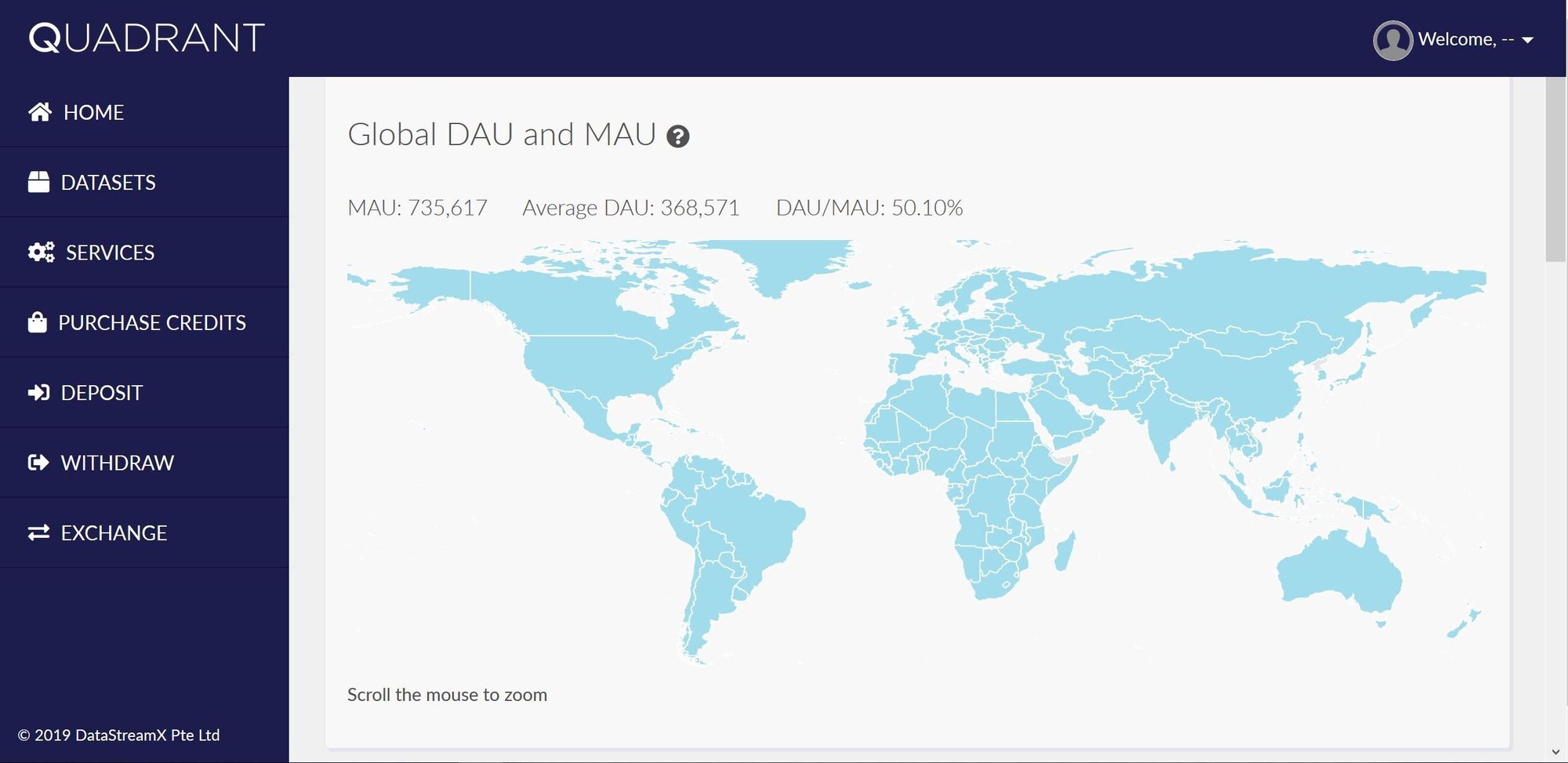
View the number of Daily and Monthly Active Users from our global data feed.
Choose by country or see the global figures.
These figures are used as a baseline gauge of location data quality.
Data completeness metrics
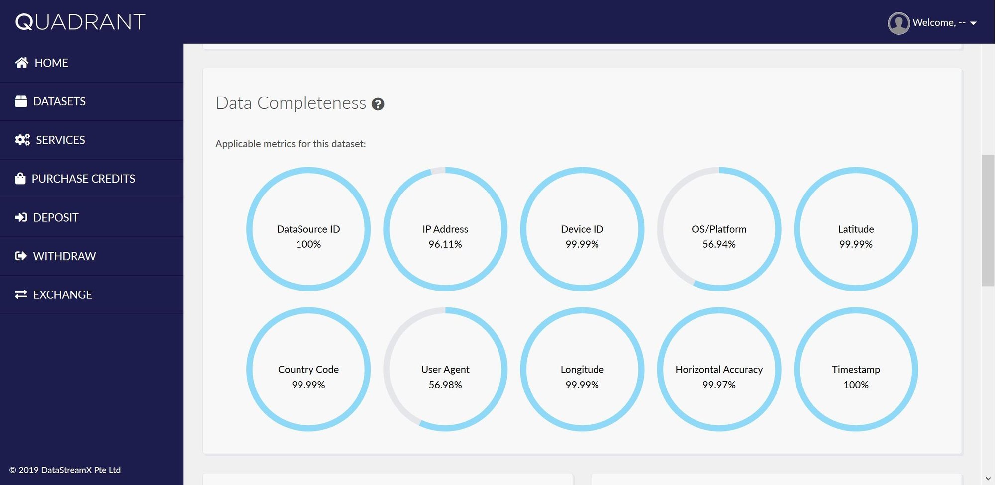
View the completeness of each data field in our feed.
Missing fields are common in location data feeds and can limit the usefulness of the feed.
Quadrant’s Data Quality Dashboard shows the amount of missing data for each data field in the feed.
Data quality distribution charts
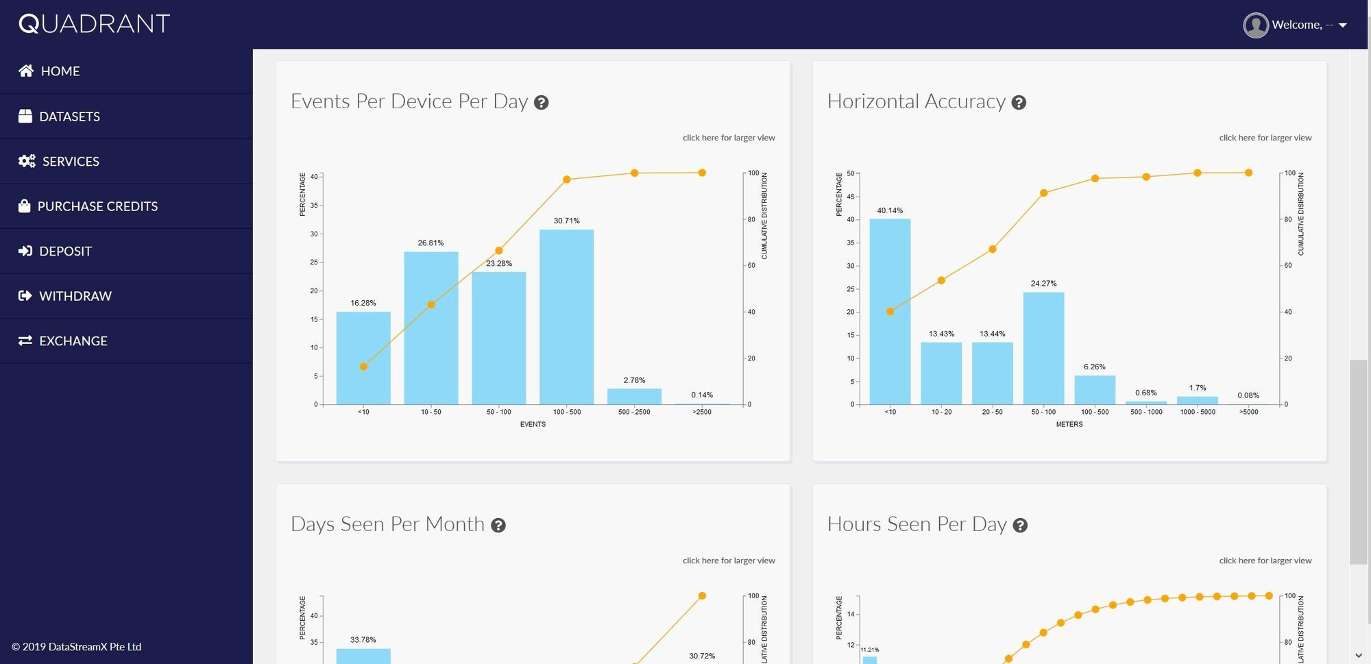
View the distribution of various quality metrics curated by Quadrant. These charts will help you get a clearer idea of the data feed's quality prior to running extensive evaluation analysis.
These are the quality metrics on our platform:
Events per device per day
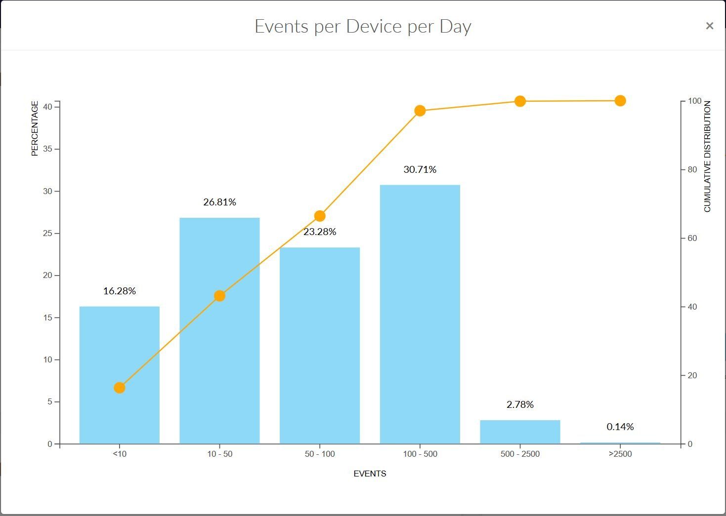
The percentage of devices generating x number of location events per day. This is a industry standard metric to establish the minimum viable daily device activity, and is typically important for those looking to perform mobility analytics and studies.
Horizontal Accuracy
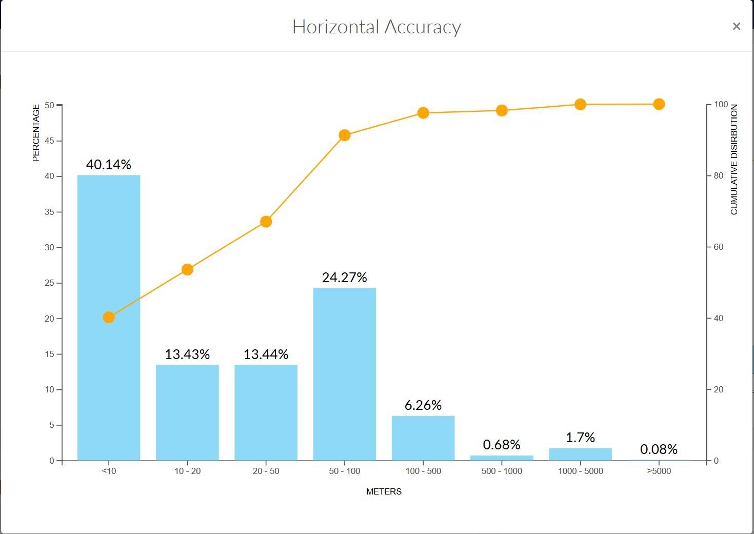
The percentage of events that have horizontal accuracy within the given range. This metric usually gives the user crucial information on the location of the event activity.
Days seen per month
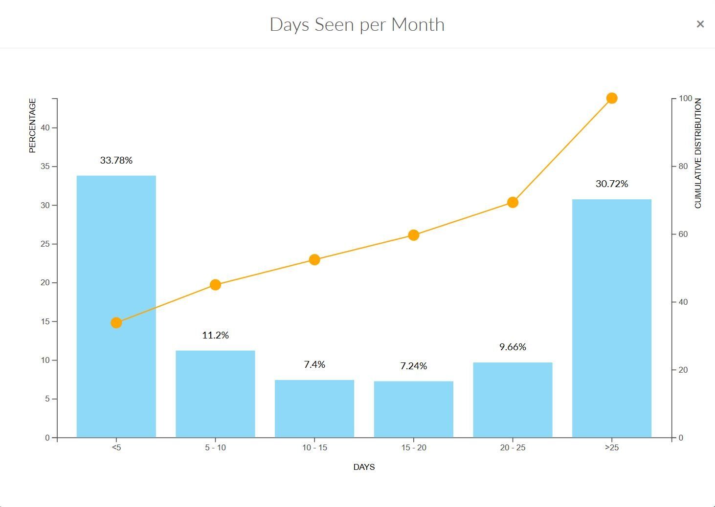
Number of days a device is seen per month. This quality metric provides information on the scale of devices available that can be reached out to, and is a important metric when one needs maximum reach.
Hours seen per day
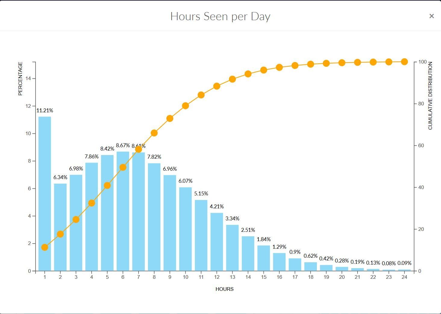
The distribution of devices seen x number of distinct hours per day. This metric captures devices seen, and by extension provides provides deep insight into macro trends.
Visit our Location Data Knowledge Base
Learn more about location data and data quality
Access Data Quality Dashboard
View these quality metrics against our location datafeeds at the link below and obtain a quick overview on how our data could fit your use case.
