For data professionals, choosing a location data feed that is fit for purpose for your project can be challenging. The problem is that it’s not always clear what the quality of a given data feed is, but with Quadrant’s Data Quality Dashboard we’re changing that.
At Quadrant, we want to give data professionals clear metrics by which to evaluate our mobile location data feeds.
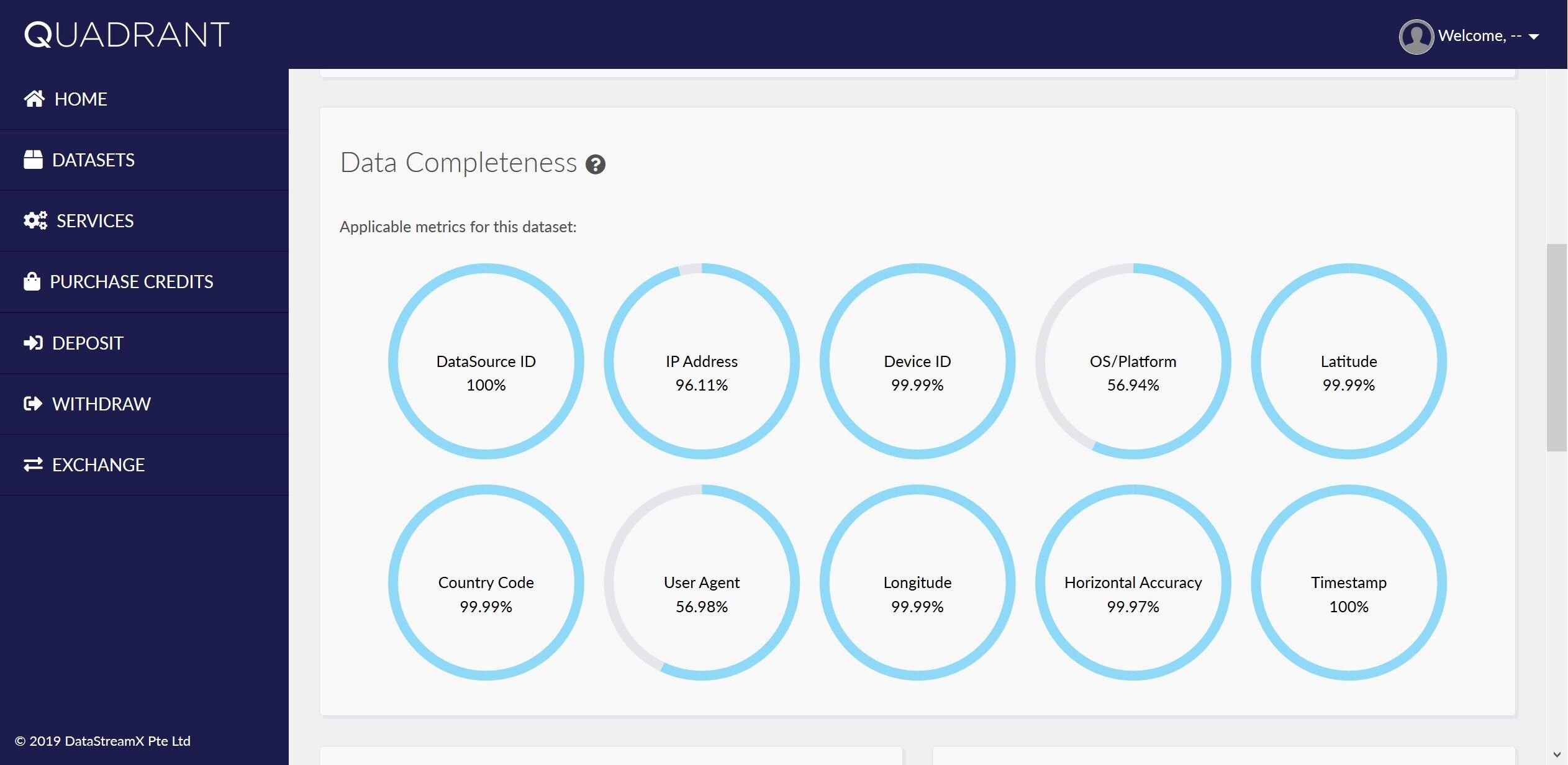
To achieve this, we’ve built the Data Quality Dashboard, which peels back the layers of geospatial data feeds to show you:
- Its completeness across 12 key metrics
- An interactive world map view of average daily and monthly active users, which can be viewed by country
- Data quality distribution charts
The goal is to help you get a clearer idea of the data feed's fit for purpose prior to purchase or the running of extensive evaluation analysis on the customer’s side – a feature we know the industry is crying out for!
The Importance of Data Quality
Today, location data is of growing importance and has uses across many industries. If you are a data professional, you will be aware of the importance of location data to your daily work and the time-consuming process of cleaning location data. While you may be familiar with some of the leading providers of location data, the reality is that they don’t provide quality indicators prior to purchase.
The average data professional is not that concerned with every metric of data quality as laid out in the Quadrant Data Quality Dashboard. The best data professionals live and die by the sword of data quality, and are always on the hunt for the best cuts of data they can get their hands on.
For some data professionals, this concept of quality is still new. However, that is starting to change. Data quality is the sole determining factor in guaranteeing accurate and reliable results.
At Quadrant, we’re pleased to be at the forefront of the industry in raising awareness of this important issue of data quality.
Our philosophy is simple: for great results, you need stellar data.

Data Quality Dashboard at a glance
So, let’s peel back the 12 data “completeness” metrics we provide you with in our Data Quality Dashboard, which form the very foundation of what we mean by data quality.
This granular approach to data is vital, because what constitutes “quality data” for one business use case may be very different from another.
For example, a project that requires a location data feed that includes 100 percent accuracy on a metric such as OS/Platform will consider the overall feed low quality if it does not deliver on this single metric – despite perhaps having near perfect scores on 11 of the other metrics.
Here’s the completeness metrics Quadrant’s Data Quality Dashboard gives you access to, prior to purchase of a given location data feed:
- Data Source ID – Quadrant's internal data source ID.
- IP Address – The IP Address generated from the device.
- Device ID – The advertisement ID from the device.
- OS/Platform – The operating system of the device.
- Latitude – The angular distance of a place north or south of the earth's equator, expressed in degrees and minutes.
- Mobile Country Code (MCC) – The two-digit alpha country code.
- User Agent (UA) – The web browser of the device.
- Longitude – The angular distance of a place east or west of the Greenwich meridian, expressed in degrees and minutes.
- Horizontal Accuracy (HA) – The radius of the collected latitude and longitude in meters.
- Timestamp – The UNIX timestamp.
- OS Version – The operating system version number.
- Device ID Type – The advertisement ID device type.
Maps and Charts
In addition to the above completeness metrics, the Dashboard allows you to view the number of Daily Active Users (DAU) and Monthly Active Users (MAU) from our global data feeds in the form of an interactive world map. You will have the option to choose by country or see the global figures, to paint a fuller picture of a given data feed.

Finally, our data quality distribution charts offer visual insights into:
- Events Per Device Per Day – The percentage of devices generating multiplied by the number of location events per day.
- Horizontal Accuracy – The percentage of events that have a horizontal accuracy within the given range.
- Days Seen Per Month – The number of devices seen multiplied by the number of distinct days per month.
- Hours Seen Per Day – The number of devices seen multiplied by the number of distinct hours per day.

Try it - free!
At Quadrant, we pride ourselves on providing quality data that is fit for purpose. To uphold this promise to our customers, we have created the Data Quality Dashboard as part of the Quadrant platform. We invite you to try it out. No need to wait – it’s completely free!
If you are a data professional looking for ways to evaluate the quality of location data prior to purchase and extensive cleaning, you have come to the right place. If you would like to speak to one of our experts to see how this dashboard can help your search for location data, contact us here.