
When we envisioned what Quadrant was going to be, we laid the problems that we wanted to solve.
One of those problems was bringing transparency to data. To this end, we are pleased to unveil our latest tool that our team built - Quadrant's Data Quality Dashboard.
Data Transparency And Data Quality Come Together
Data quality is subjective to the business use case. We understand this fact, and work with our customers to provide them with fit-for-purpose data that meets their specific data requirements.
Our Data Quality Dashboard adds transparency into our customers' data acquisitions process.
It has a suite of metrics that allows customers to evaluate the quality of the location data feeds available on our platform in order to help them select the data feed that fits their specific insights.
Suite of Data Quality Metrics
Our dashboard provides quality metrics and overall completeness scoring giving customers, a quick overview of our data feeds prior to running full evaluation analyses.
Examples of our metrics are below:

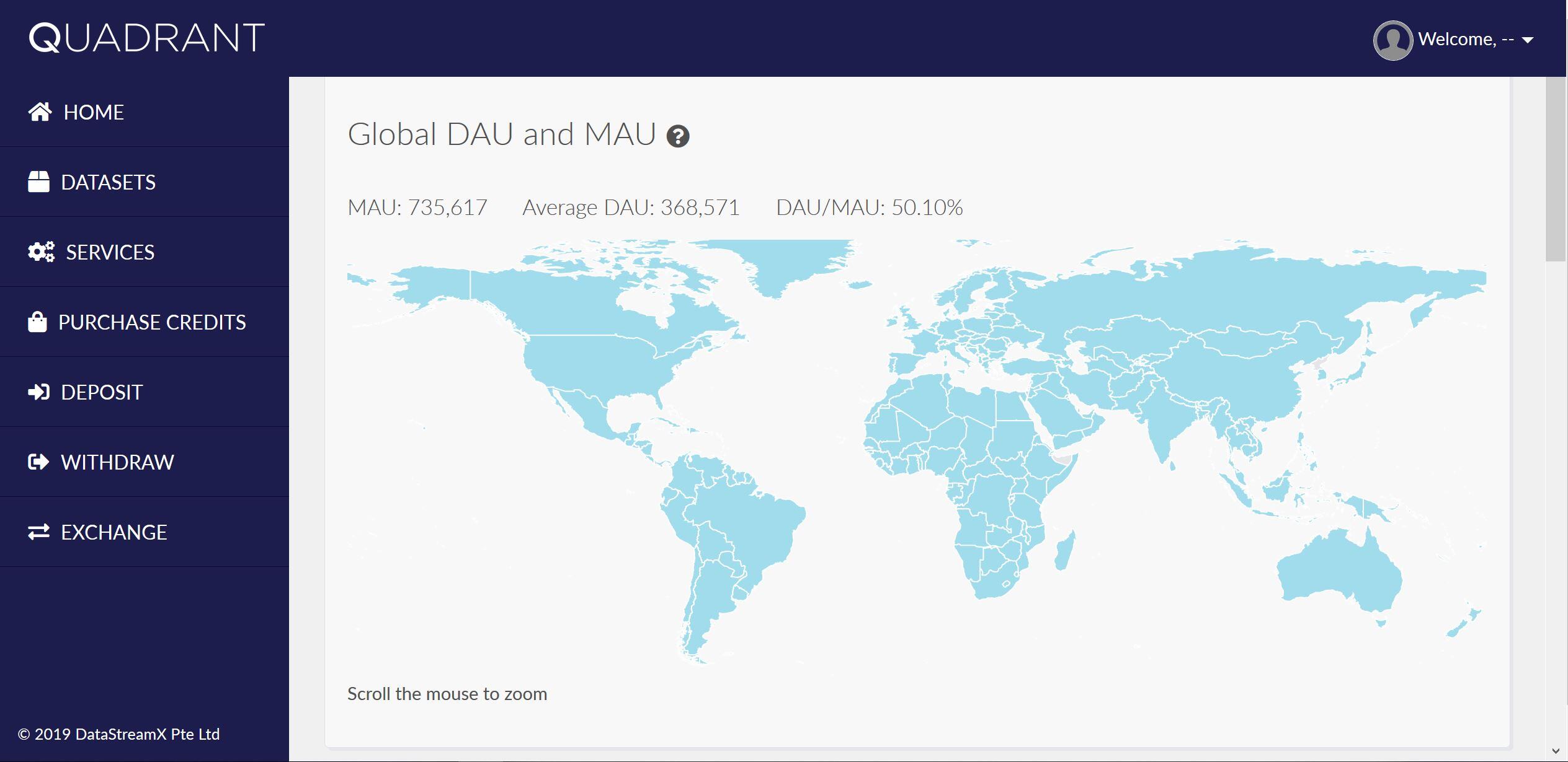
Daily and Monthly Active Users

Data Completeness Matrix

Overall Panel of Data Quality Charts.
For more information on the Data Quality Dashboard, please visit the link below:
Or if you would like to access the Data Quality dashboard, you may do so so here:
What Next?
This Data Quality Dashboard was just the next in line on what we promised to deliver, and it is now ready for usage.
We do have something new to announce in the coming weeks, and we cannot wait to share more information soon.
To find out more, visit our website
-1.png)